Tactic Bureau: naming, brand identity & website for an M&A consultant managing $220M+
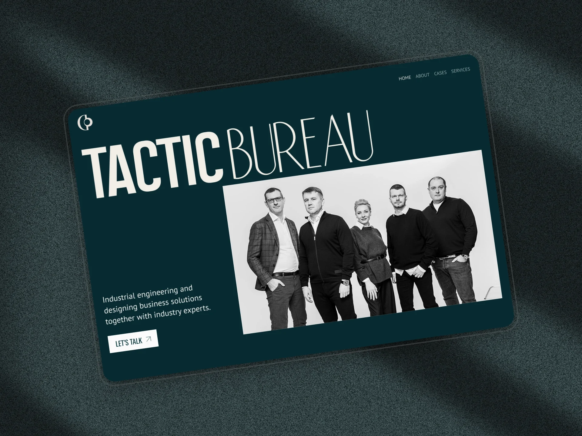
annual revenue under the founder's management
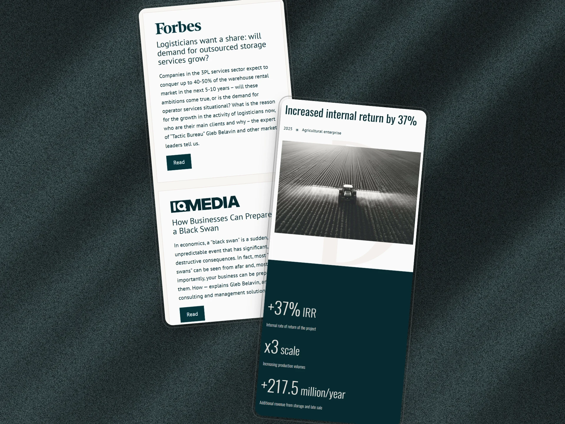
Tactic Bureau is a consulting firm for asset management, capital growth and M&A transactions, founded by Gleb Belavin. Its founder has 15+ years in commercial real estate and logistics, manages assets with total annual revenue above $220 million, represents business owners in complex corporate disputes and is a recognized expert contributor to Forbes and other business publications. Tactic Bureau came to us for a brand and a website from scratch, naming included.
What they built for us isn’t just a site, it’s a strategic asset! You didn’t just create visuals — you built a whole strategy: concept, naming, and precise positioning.
 Vera MatveevaHead of Communications, Buro Taktika
Where the name Tactic Bureau came from
The brief was unambiguous: every element had to communicate the firm's level: premium consulting, analytical precision, calm authority. We started with the brand concept. A series of deep working sessions with the founder helped us understand the essence of what Tactic Bureau needed to communicate before a word was spoken. From those sessions, the name itself emerged: "Tactic Bureau" — a combination of analytical precision ("bureau" as structured, systematic thinking) and practical results ("tactics" as concrete action and forward motion). A sharp, concise name that immediately signals the premium nature and seriousness of the work.
Why the palette is deep emerald
With positioning established, we moved to visual identity. The palette was built around deep emerald — authoritative, refined, and distinct in the consulting space. The logo and brand mark were constructed on a strict mathematical grid, reflecting the precision and structural thinking at the core of what the firm does. Typography was chosen for elegance and legibility across all contexts. We delivered a complete brand guideline covering logo usage, color system, patterns, and typography — a long-term branding tool designed to work equally well in business documentation and digital communications.
Typography as the main element of the site
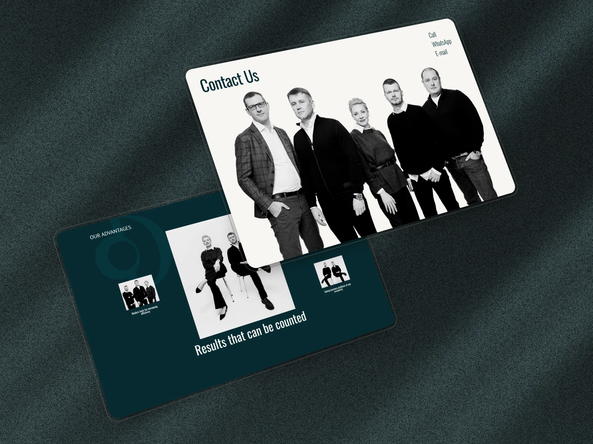
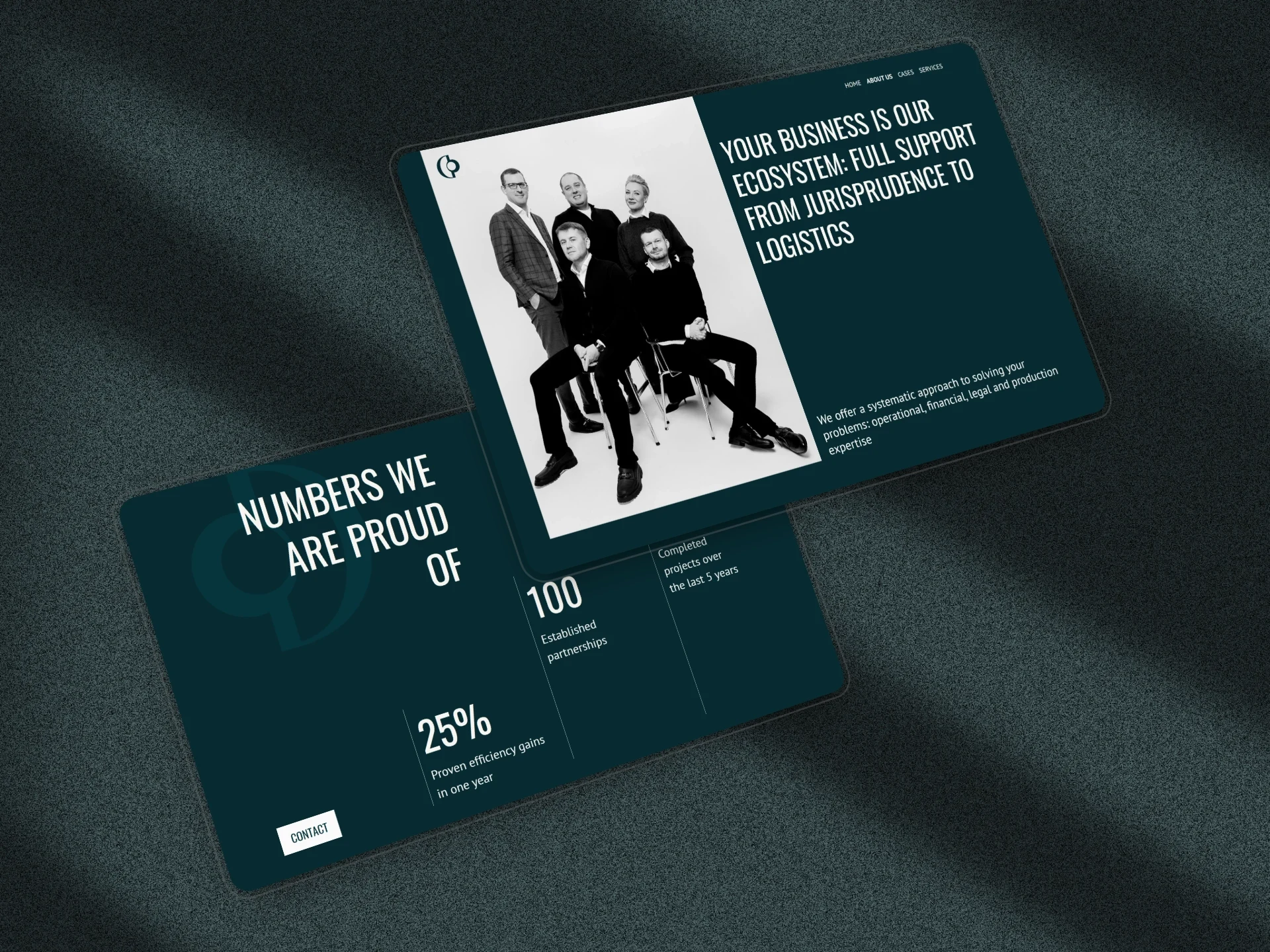
The corporate website was built on the same principles: minimalist and lightweight, with generous white space, bold headlines, and a focus on team presence and meaning. Typography was used as the primary expressive element — large, well-balanced, structured. Navigation was kept simple: expertise, services, case studies, and a clear path to get in touch. The site is fast, fully responsive, and built to create an immediate sense of premium service from the first scroll.
Partner feedback after launch
After launch, the client reported highly positive feedback from partners and corporate clients. The brand and website now communicate Tactic Bureau's values and expertise before the first meeting takes place.
Building a premium B2B brand that needs to match the level of your clients and expertise? See how we approach branding for B2B companies.
What Tactic Bureau got
- Company name "Tactic Bureau" developed from scratch
- Full brand identity: logo on mathematical grid, emerald palette, brand guidelines
- Corporate website: minimalist, fast, fully responsive
- Immediate positive feedback from partners and corporate clients after launch
- Brand positions the firm at the level of its audience — business owners and top executives
More case studies
All case studies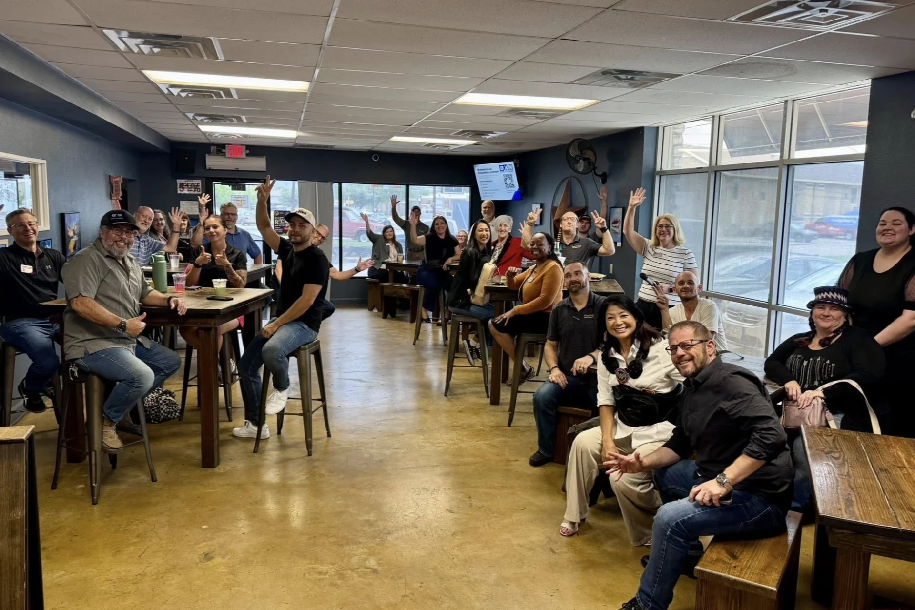
An Austin networking group's AI-built site and app, guided by us: #1 for its main search
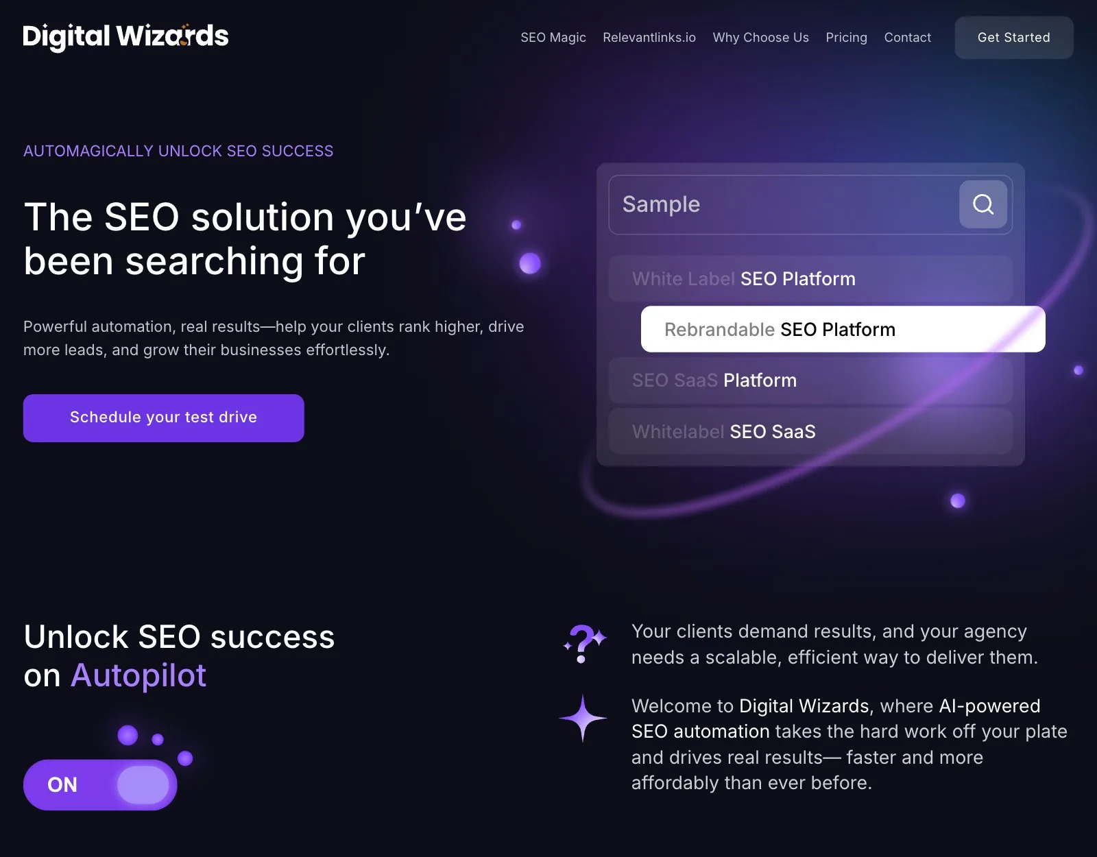

An SEO platform up against Ahrefs and SEMrush: brand, landing page at 99/100 PageSpeed
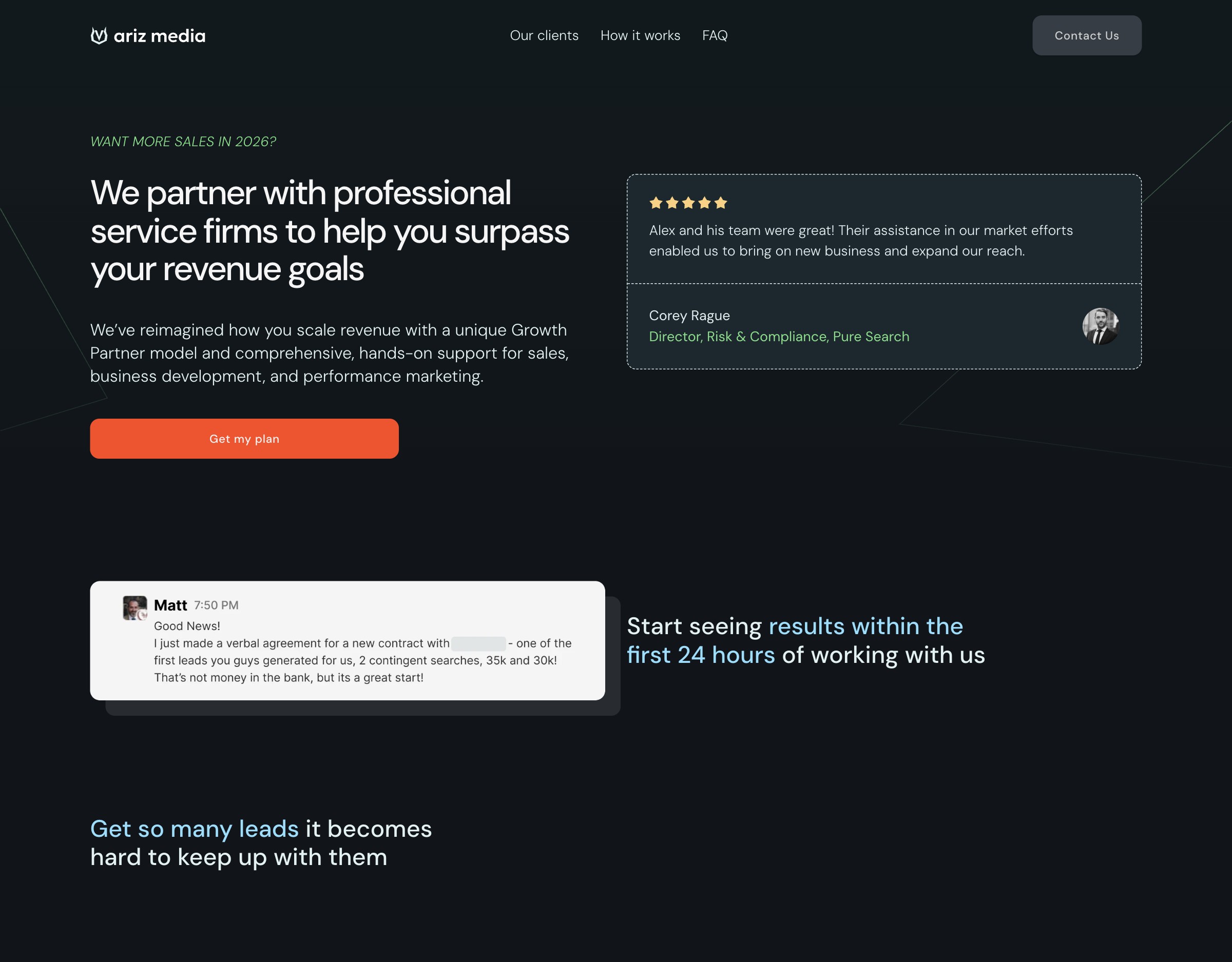

A London B2B agency's paid-traffic page and lead-qualifying form; sales cycle 2× shorter