Razvitie came to us with a clear product — 16 years of building homes people actually want to live in — but a digital presence that didn’t match that level. They needed a website that could do what their best projects do: make someone feel something before a single conversation happens.
The challenge wasn’t technical. It was conceptual. Home construction is a trust category. The buyer isn’t looking for the cheapest option — they’re looking for someone who understands how they want to live. The website had to communicate that from the first scroll.
Positioning: designing a life, not a house
We started with positioning. Razvitie doesn’t sell houses. They help people design the life they want around a space. That became the spine of everything — copy, layout, imagery, section order. The hero headline, “You have a dream. We have the expertise to build it,” was written to land that idea in under three seconds.
Architecture as the visual language
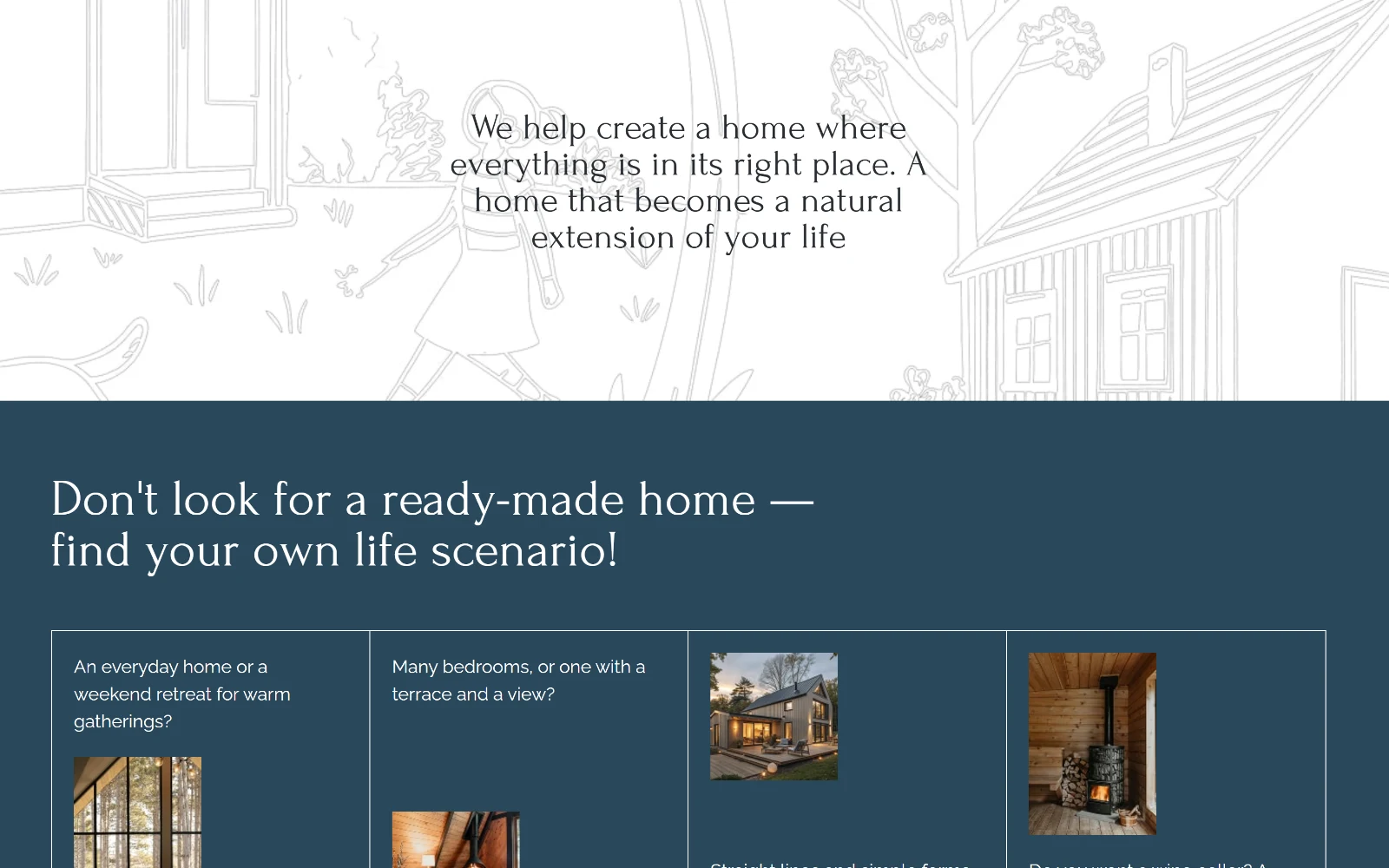
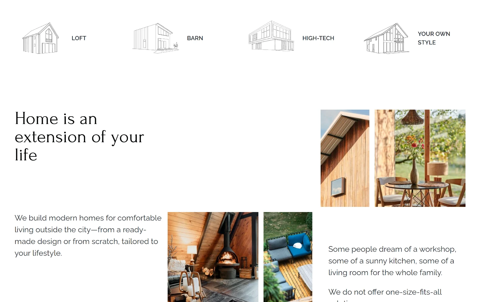
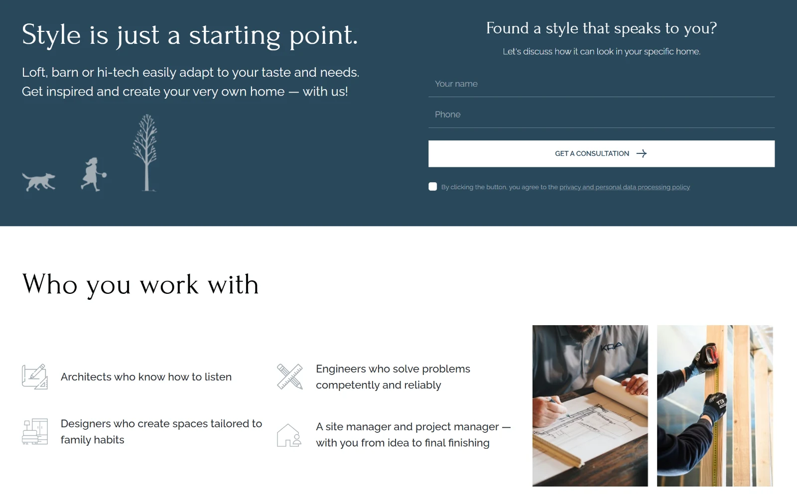
The design followed the brand’s natural language: architecture. We built the site around full-bleed photography, minimal UI, serif typography, and a dark blue/white palette that reads premium without being cold. Line-art house illustrations run as a background motif, connecting the sections visually and giving the site a distinctly architectural feel — something rarely done in market construction.
Section order follows the buyer’s decision
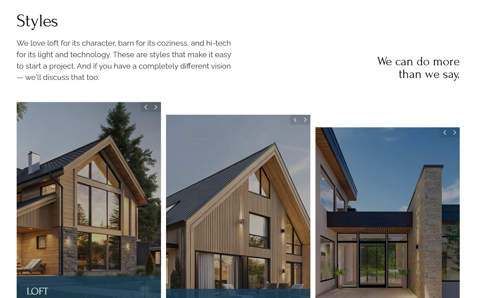
The structure was engineered around how a buyer actually explores a decision this size. Styles (loft, barn, hi-tech) come early so visitors can self-identify. Philosophy and team sections build trust before the visitor considers contacting anyone. A scenario-based section — “Don’t look for a ready house — find your life scenario” — handles objections and speaks directly to people who know what they want but don’t know how to start. Village selection and a plot presentation section expand the offer and increase average check potential.
Responsive build, galleries and CRM forms
On the technical side, we built a fully responsive layout with smooth scroll behavior, lazy-loaded image galleries with intersection-based animation, and multiple lead capture forms with different hooks: callback, consultation, presentation download. All forms route to the client’s CRM.
From browsing to a conversation
The result is a site that works the way a premium construction brand should: quietly confident, visually rich, and built to move the right person from browsing to a conversation.
Working on a construction company or custom home builder website? See how we approach construction industry marketing.


