B2B website examples: 11 sites we built for complex products, with results
Most lists of B2B website examples show Stripe, HubSpot and Asana. They look great, but the people who wrote those lists didn't build them, and none of the lists says what the site did for sales.
These are B2B websites we built ourselves, for companies with a complex product and a long sales cycle. A warehouse lease can take six months to a year to sign; for manufacturers a deal usually takes one to three months. A site like that has to work for several buyers over many visits. For each one we show who buys, what the site had to do, what we built and the result.
What B2B websites that sell have in common
From our projects, every B2B site that brings in requests has these:
- A clear offer on the first screen: what you do, for whom, and why you rather than the next supplier.
- A path to the request through a request form, not a generic contact page.
- A call to action that says what happens next. Never “Get in touch” or “Learn more”.
- More than one angle on the offer. Different buyers care about different things, so the offer is shown from each side.
- A free lead magnet: a checklist or a book. It really works in B2B: buyers who aren't ready to talk still leave an email.
- A decision on who takes which path. Someone comes for one piece of equipment, someone else to equip a whole lab; a buyer and a distributor need different pages.
Video helps conversion: a short company presentation in the hero that explains the buyer's key benefits, and a video next to the form.
One page or several? If the business has one direction and one need, one landing page converts better than a multi-page site. A multi-page site shows expertise and carries more content, but the page that converts is almost always a single landing page. When there are several segments, each gets its own entry: its own landing page or its own path through the site.
Manufacturing
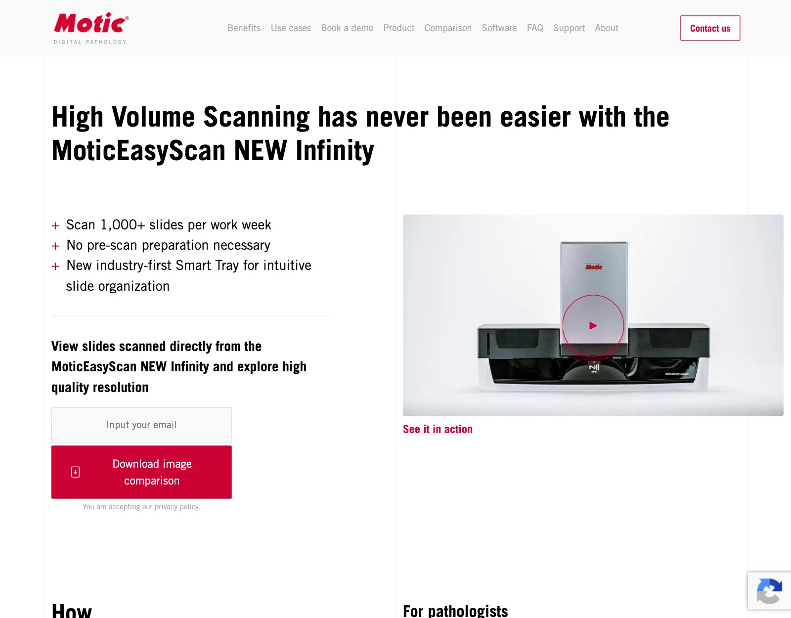
Motic: a US product launch to four audiences
- Buyers: pathologists, physicians, lab managers and hospital administrators.
- The site's job: launch the MoticEasyScan Infinity scanner line in the US on a tight deadline.
- What we built: four landing pages, one per audience, inside Motic's brand guidelines. A lead magnet fed emails into Salesforce and Mailchimp, with Zapier for the rest of their tools.
- Result: the landing pages converted 3× better than the previous product pages, and all of Motic's 2022 customer acquisition goals were met.
- What we learned: the same scanner is bought for different reasons. Pathologists were shown the technology and the quality of the results; hospital administrators were shown the savings and the productivity gain.
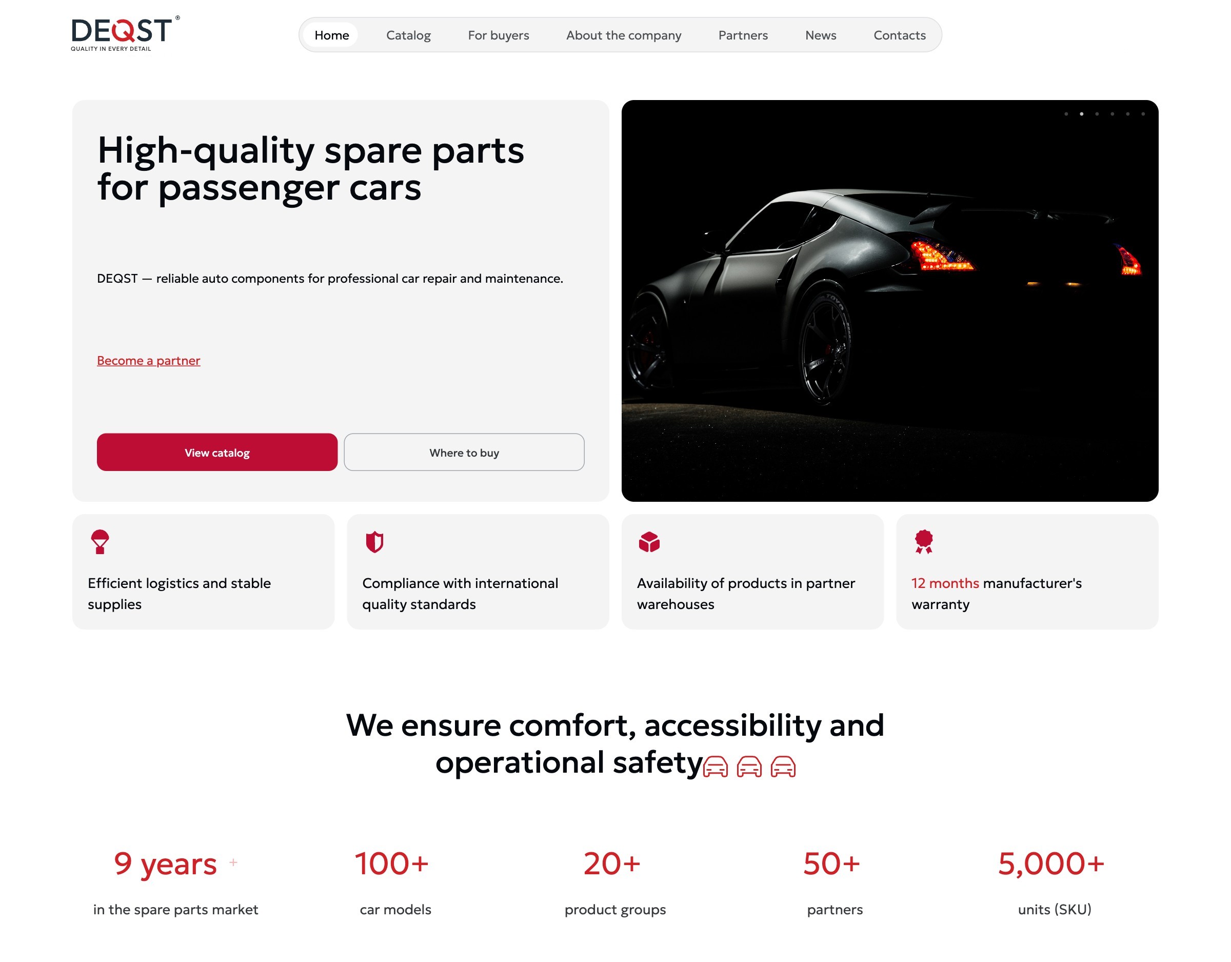
DEQST: a catalog of 5,000+ auto parts for buyers and distributors
- Buyers: repair shops and car owners who need one part; distributors deciding whether to carry the brand.
- The site's job: get a buyer to the right part fast, and show distributors a serious manufacturer.
- What we built: separate menu sections for buyers and partners; a catalog by vehicle system with 50+ subcategories; part-number search; a copy button for the part number on every card; a partner page with an application form and a presentation.
- Result: distributors got in touch and called more often. The client told us distributors like the site: the catalog is clear and easy to filter. A new product group added 20+ subcategories without a new template.
- What we learned: for distributors, the brand had to read as a serious company. That is what raised their trust.
Professional services
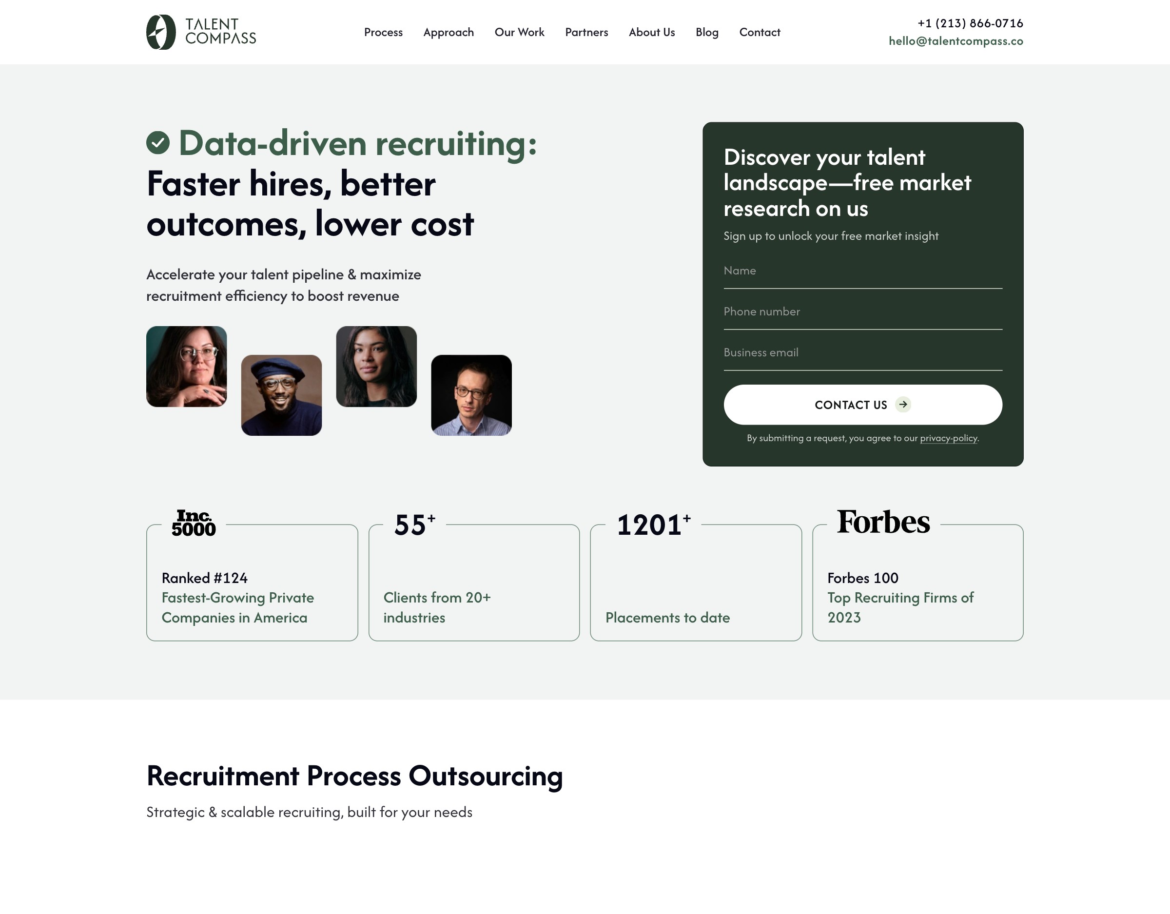
Talent Compass: one page for executive search, plus a page for a new segment
- Buyers: companies hiring at the C-suite and leadership level.
- The site's job: a brand and a site that Google and LinkedIn ads can run on.
- What we built: a rebrand and a one-page site built for ads, at 100/100 Google PageSpeed. Then a separate landing page to enter one more segment: veterinary clinics.
- Result: the firm runs its LinkedIn ads on the site and stays on our monthly support. Its co-founder and CEO, Alex Ham, on Clutch: “the visual refresh has clearly elevated how our company is perceived externally”.
- What we learned: executive search has one need, finding an executive for a role, so one landing page converts better than a multi-page site. A new segment gets its own page instead of a new menu item.
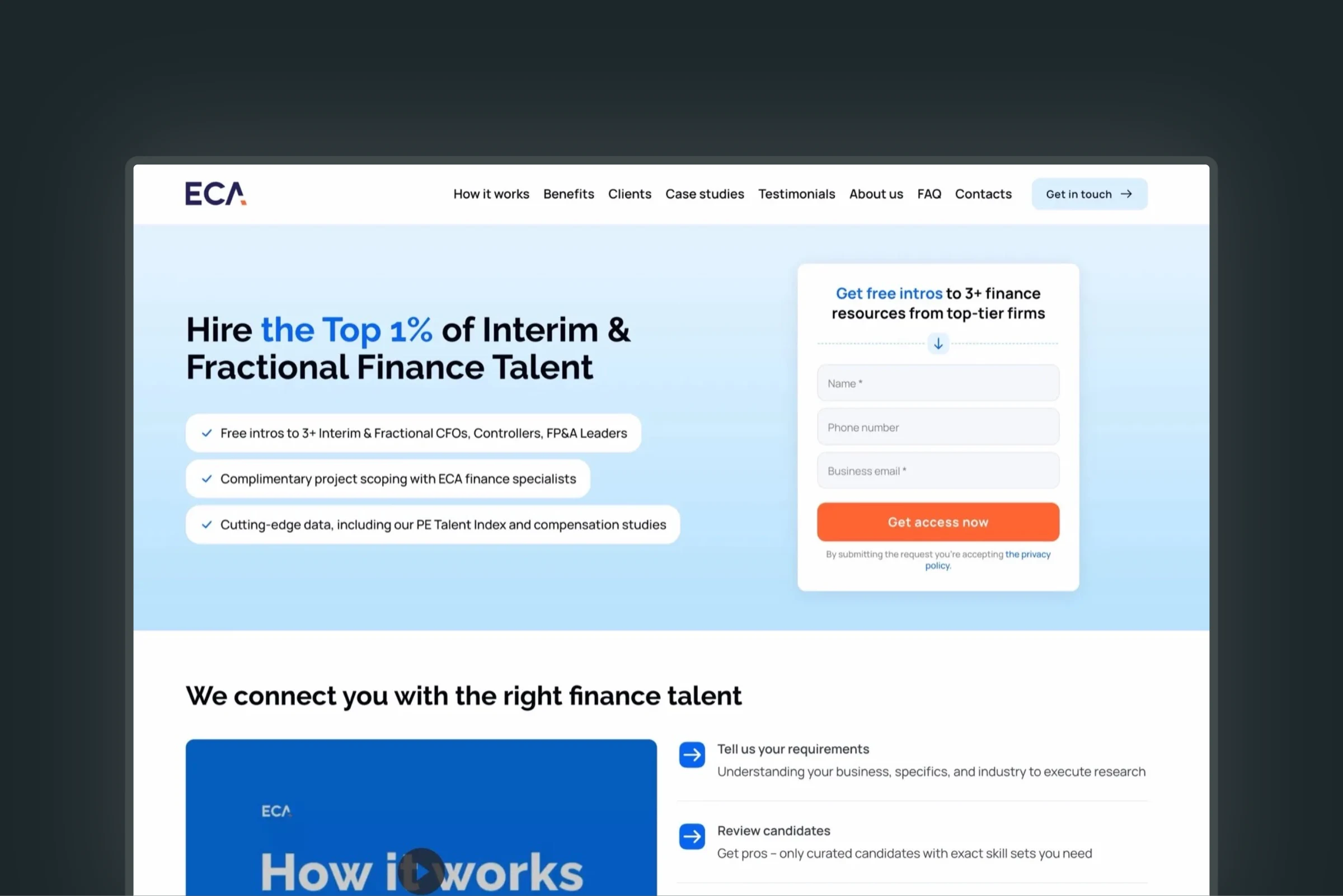
ECA Partners: a slow, glitchy site fixed for a PE staffing firm
- Buyers: private equity firms and their portfolio companies, a market where credibility is non-negotiable.
- The site's job: stop losing leads to a slow site with security holes that a previous vendor hadn't fixed.
- What we built: a technical audit and fixes (90/100 PageSpeed on the corporate site), a brand refresh, and three landing pages for interim finance and accounting rebuilt for conversion (100/100 PageSpeed on the new ones).
- Result: no bugs, glitches or security holes left after the audit; more inbound leads and calls to the sales team.
Ariz Media: a qualifying form that halved the sales cycle
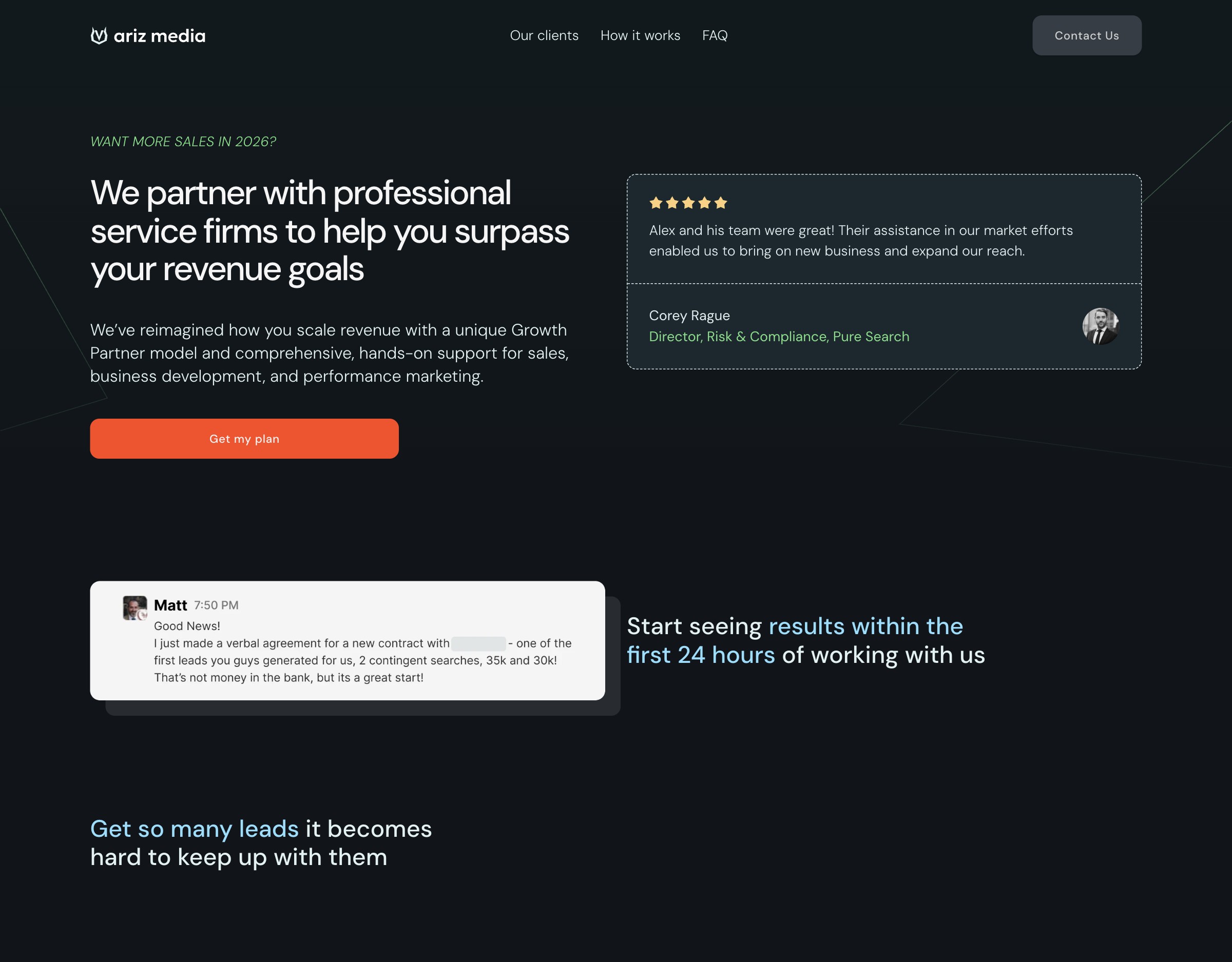
- Buyers: professional services firms looking for a premium marketing agency.
- The site's job: a landing page for paid traffic that shows the agency's level and filters leads before they reach sales.
- What we built: a restrained dark design, dense expert content in cards and tabs, case results, testimonials with photos, a downloadable book as a lead magnet, and a qualifying form connected to the CRM.
- Result: the sales cycle became more than 2× shorter, and leads arrived more relevant and better prepared.
- What we learned: qualifying by business and budget cut the spam and brought the right buyers. Their form asks for last year's revenue, the revenue target and the top priority for the year.
3PL and logistics
A&O: another contractor's landing page rebuilt before the ads ran
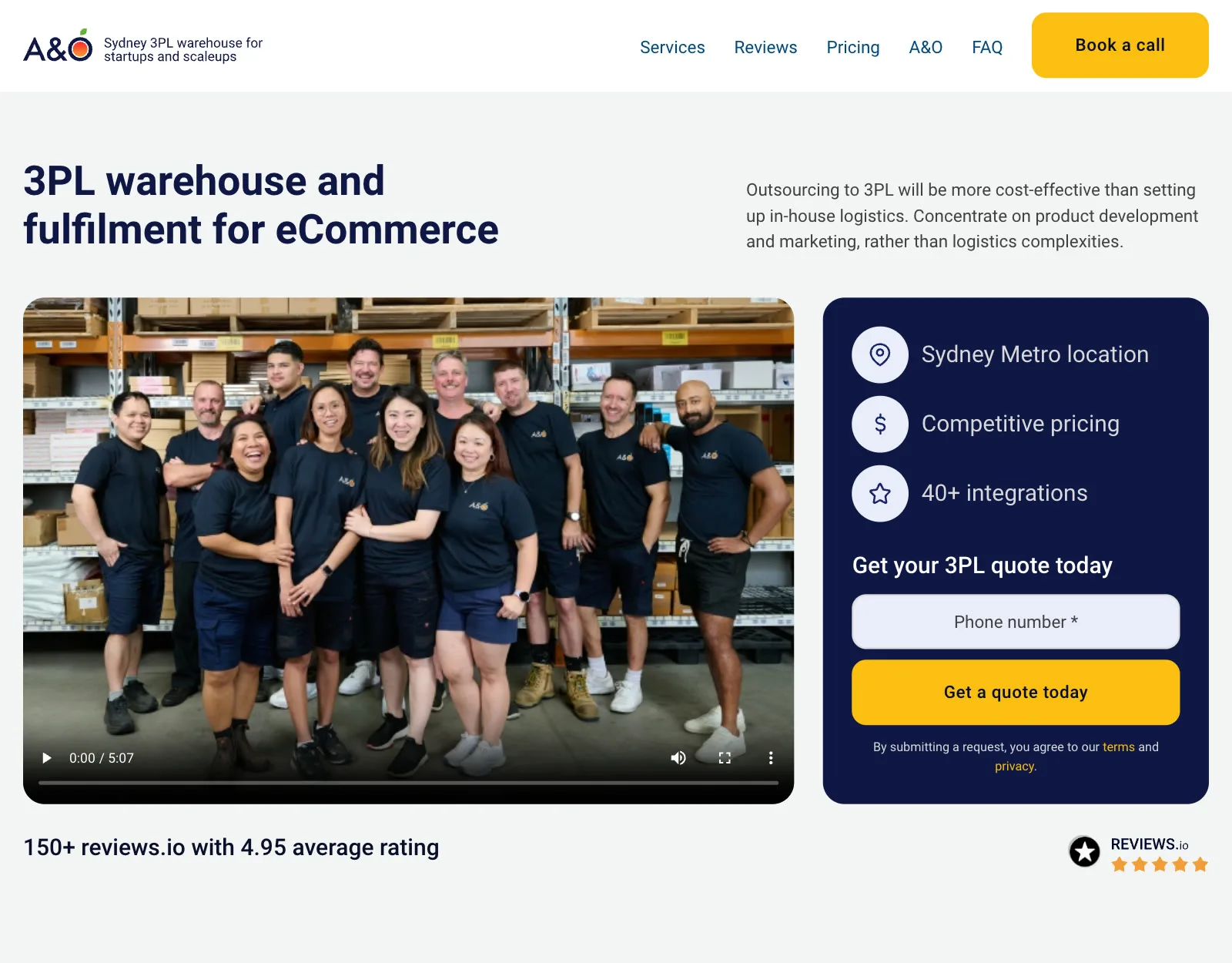
- Buyers: shippers looking for 3PL, fulfillment, direct mail and print in Sydney.
- The site's job: stop the ad budget from going into a page that didn't convert.
- What we built: an audit, then a rebuilt WordPress landing page with a stronger conversion layer, fast on every device, with spam protection in place before any ad traffic.
- Result: a multiple return on marketing spend.
- What we learned: the old page had problems with performance and SEO, and nobody had worked out the funnel or the path to a request. Bots could leave requests too, so without protection the ad budget would simply have drained.
Kosmos Logistic: three empty buildings let in three months
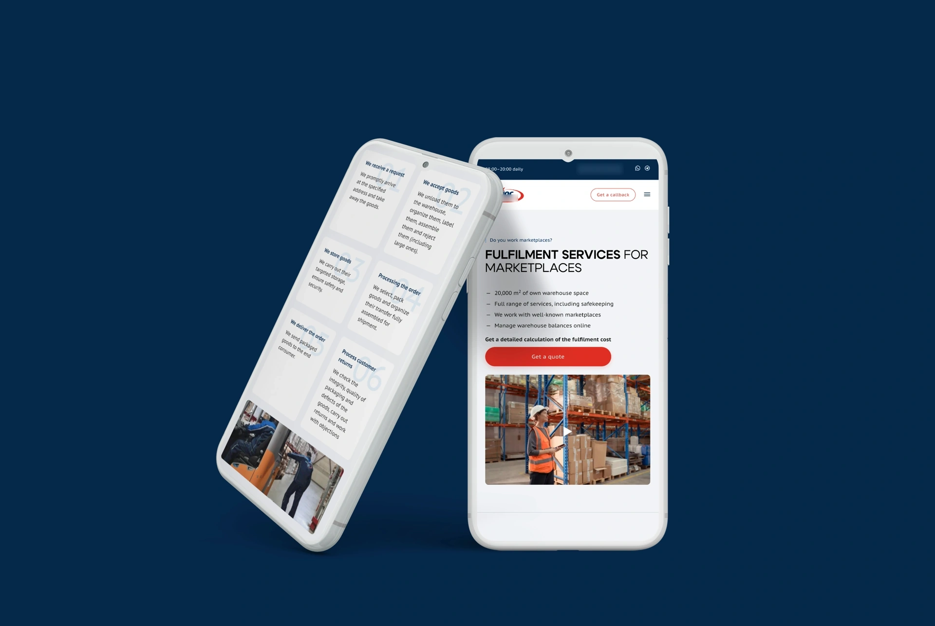
- Buyers: companies looking for 3PL and fulfillment space.
- The site's job: fill about 129,000 sq ft in a location with poor road access and strong competition.
- What we built: positioning and an offer for the 3PL services, the site, SEO and ads.
- Result: all three buildings let in three months, organic visitors up 300%+ over three years, no brokers.
- What we learned: the owner didn't believe the internet could bring tenants. After this he moved to leasing on his own, without broker commissions, and his cost per tenant fell several times over.
Logistic Declarant: a customs brokerage brand launched in five weeks
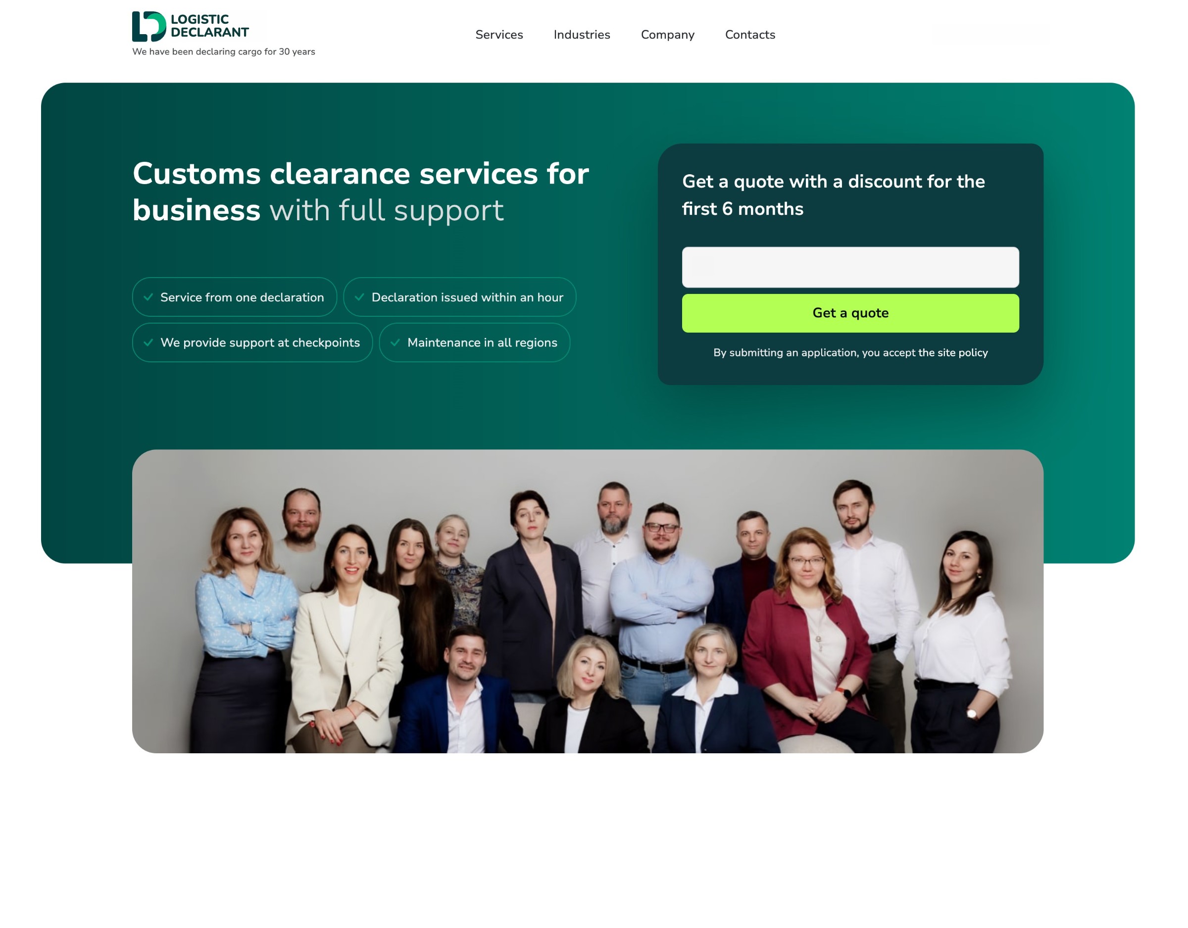
- Buyers: companies that move goods across borders and need customs clearance.
- The site's job: launch a new brand from scratch for a team with the expertise but no brand and no site that sold.
- What we built: the logo, a landing page and ad campaigns in five weeks.
- Result: the first dozen inquiries in the first week, 180+ calls and inquiries a month, a 3× return on ad spend.
Warehousing and industrial real estate
MLP: 97% occupancy for a Class A warehouse portfolio
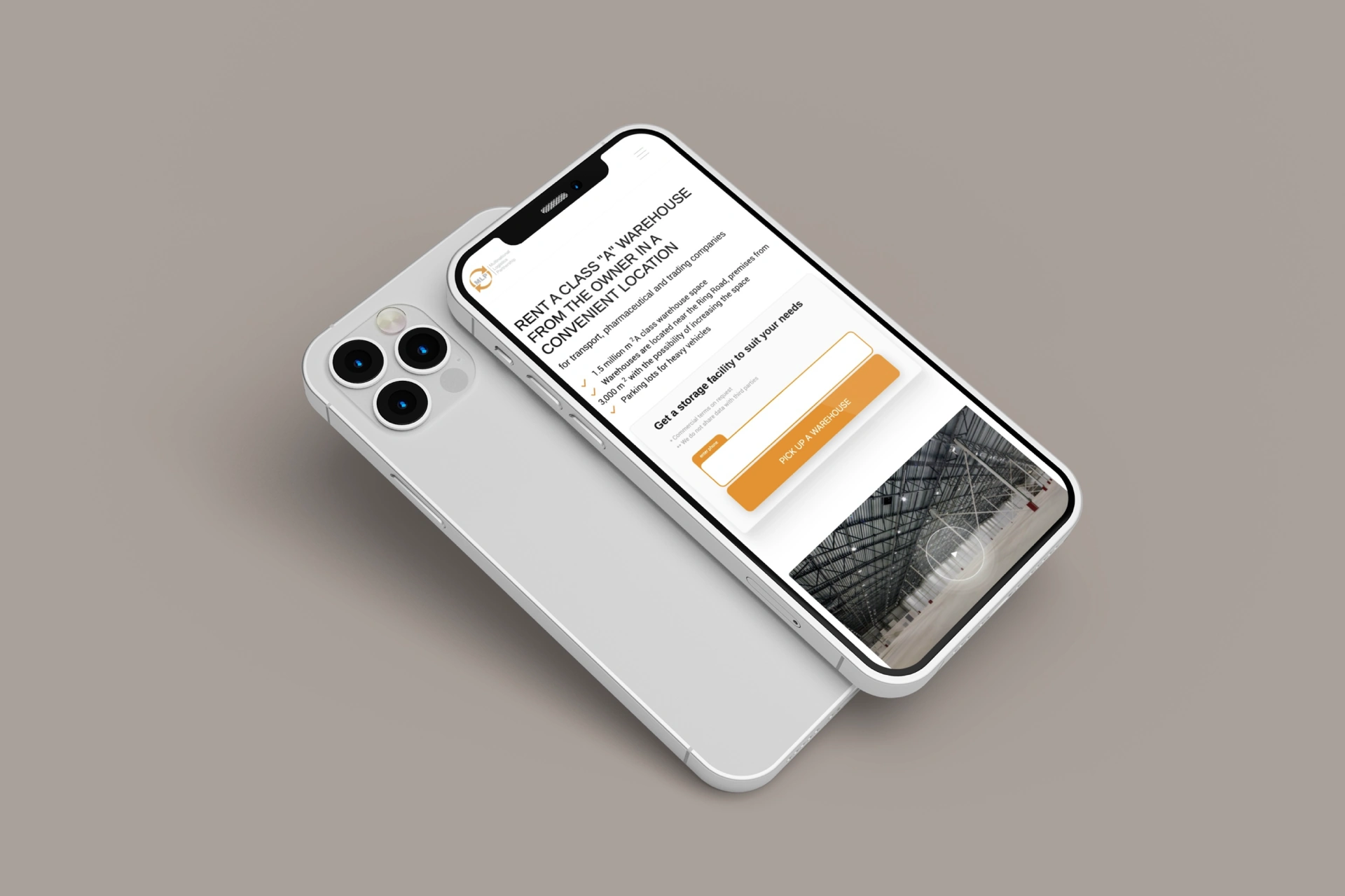
- Buyers: transport, pharmaceutical and retail companies, each with its own criteria for a warehouse.
- The site's job: a steady flow of tenants without depending on brokers.
- What we built: three offers, one per segment, in a multi-landing system inside the main site, with content that changes by the visitor's industry and constant A/B tests; search and display ads for rentals of 21,500 sq ft and up, with remarketing to warehouse audiences.
- Result: 97% occupancy, a record in MLP's history, with rental inquiries every day across all complexes.
- What we learned: the calls came from a short landing page that showed the offer directly: a video of the warehouses, three clear bullets with the price and the locations, a reworked first offer and a simpler request form.
IC Park: industrial space sold before it was built
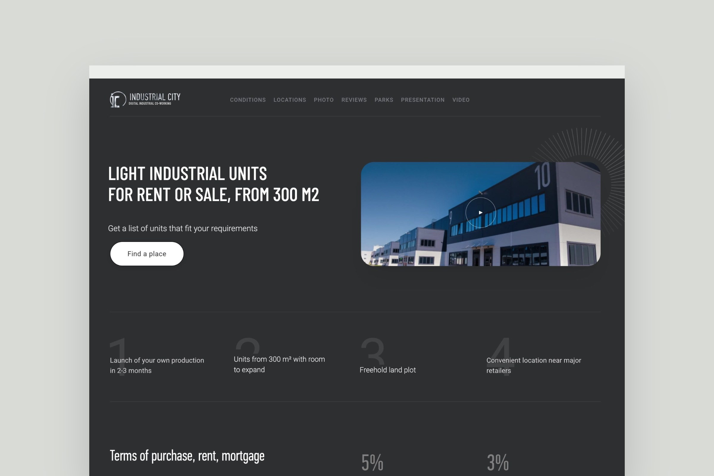
- Buyers: production companies, logistics operators and distributors.
- The site's job: sell units in light industrial parks still under construction, with no brand and no digital presence.
- What we built (launch, 2018–2019): a site with an interactive map of unit parameters and live availability, synced with the CRM; one landing page with a different offer for each segment; search ads by buyer intent.
- Result: about 248,000 sq ft sold in the first eight months, nearly 3× the client's own plan. The park won the PROESTATE & TOBY Award in 2019.
- What we learned: space that isn't built yet sells when the site shows the project, the benefits of entering early and the proof: similar projects already delivered, not the first park. The financing mattered as much: favorable loans and installment plans at the construction stage.
Investment
M24 Invest: one site, two paths
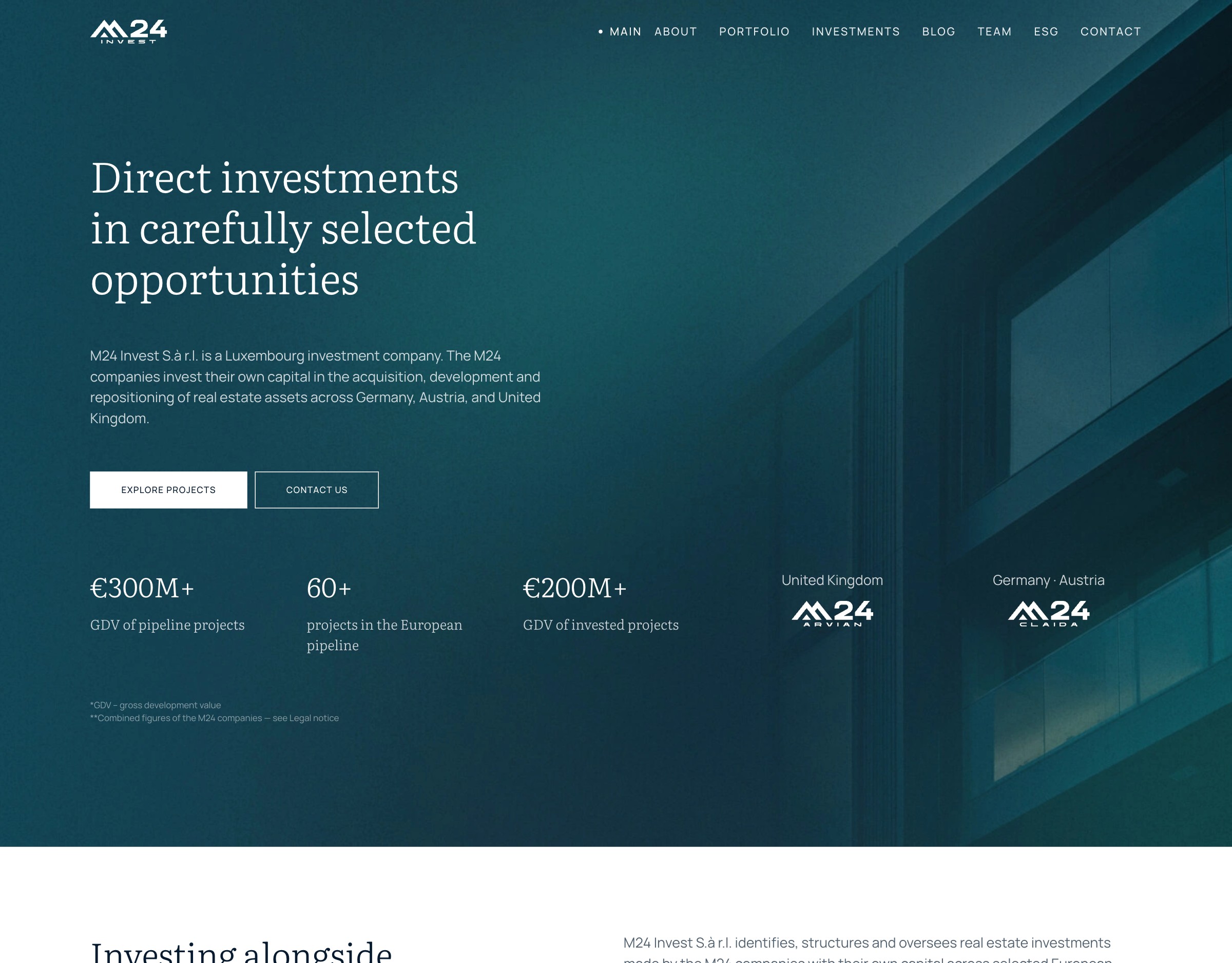
- Buyers: investors and developers, the company's two typical audiences.
- The site's job: present a Luxembourg investment company with restraint and send each audience its own way.
- What we built: the brand inside the group's umbrella identity, a site with one path for investors and one for developers, 130 articles moved with their addresses and dates, and 243 old addresses redirected, each one checked.
- Result: 97 Google PageSpeed on a phone.
What breaks B2B websites
- A form that doesn't work. We've seen forms that were broken for half a year before anyone noticed.
- A form that is too simple. One “Contact Us” form expected to take every kind of request: the buyer doesn't know what to write, and sales gets spam.
- Weak buttons. “Get in touch” and “Learn more” don't tell the buyer what happens next.
- A redesign for looks. One client rebuilt a site that was converting, just to make it prettier. Conversion fell almost 3×, sales fell with it, and the old version had to come back.
- Ads before the page is ready. Slow pages, no worked-out path to a request and no protection from bots turn the ad budget into clicks that never become requests.
Before you send paid traffic anywhere, check your own site against our 3PL website checklist or the CNC machine shop website checklist.
What a B2B website costs
Our published prices:
- Business website, up to five pages: $3,800, 3–4 weeks.
- Custom website: from $7,500, 8–10 weeks.
- Larger B2B sites with catalogs, filters or calculators: usually $10,000–15,000. For manufacturers, a site usually lands at $10,000–20,000.
What's included and how payment works → website development
FAQ
What makes a good B2B website?
A clear offer on the first screen, a path to the request through a form that qualifies the buyer, a call to action that says what happens next, a page or path for each type of buyer, and proof: cases with numbers. A lead magnet such as a checklist catches buyers who aren't ready to talk yet.
Should a B2B website have separate pages for different buyers?
Yes, when the buyers want different things. Motic got four landing pages for four audiences; DEQST has separate paths for buyers and distributors; M24 Invest has one for investors and one for developers. If the business has one need to serve, one landing page converts better.
Is one landing page enough for a B2B company?
For one service and one buyer, often yes: Talent Compass runs its ads on a one-page site. A multi-page site carries more content and shows expertise; a new segment gets its own landing page.
How long does it take to build a B2B website?
About 3–4 weeks for a business site of up to five pages, 8–10 weeks for a custom site, and longer for larger sites with catalogs and integrations.
How much does a B2B website cost?
From $3,800 for a site of up to five pages and from $7,500 for a custom site. Larger B2B sites with catalogs, filters or calculators usually cost $10,000–15,000; manufacturers usually spend $10,000–20,000.